


Artora Batik 11.11 Promotion Design

11.11 Batik Artora Promotion Design From Ideas, Concepts, Model Selection, Mockups, to Coherent Copywriting
A casual note on how the creative process can remain efficient without causing clients to go over budget, and can even save up to 10 million more simply by adopting a more modern and intelligent approach to work, especially with the rapid development of AI. .
Hello, friends,
At ryanpratama.com, I often talk about websites, hosting, design, and the digital ecosystem.
But this time, I want to take you behind the scenes: how I build a design portfolio from ideas and concepts, choosing “models” for mockups, to copywriting that must be in harmony with the visuals. without an expensive photographer, without a studio full of lights, but still looking professional and neat.
This article is not about comparing who is better or cheaper, but rather about my journey in creating a realistic and efficient portfolio for my clients and myself.
When a Portfolio Is More Than Just a Collection of Images
A few years ago, I still thought that a portfolio was just a gallery. The important thing was that it looked good, period. You can see it at behance I
But as time goes by, I realize: portfolio is a story. And the story begins with an idea, not with a good and cool Photoshop.
Sometimes clients ask, “Sir, do we need a photographer for product photos? Or a studio?”
The answer: not always.
With the right workflow, clients can save up to over 10 million only from the decision to not doing a photoshoot and using high-quality mockups + consistent visual direction.
Starting with the Idea “What Story Do You Want to Tell?”
To be honest, I rarely start with tools.
I started with this question in my head:
- What emotion do you want to convey?
- What kind of atmosphere would this product/brand fit into?
- If people look for 3 seconds, what do they see?
I usually write in simple words, for example:
- warm
- professional
- elegant
- futuristic
- handmade
- friendly
- minimum
From this short list, the visual concept becomes easier to direct.
Determining the Visual Concept From Moodboard to Color
Once the idea felt solid, I moved on to the concept stage:
- Mood board (Pinterest, Behance, Dribbble)
- Visual style (luxury, editorial, playful)
- Color tone (dark, warm tone)
- Typography (humanist, modern sans, classic serif)
This concept will “lock in” the quality of the portfolio so that it is not haphazard.
Interestingly, a clear visual concept also makes the copywriting work at the end much easier, especially with AI such as ChatGPT that can be directed to create good copywriting.
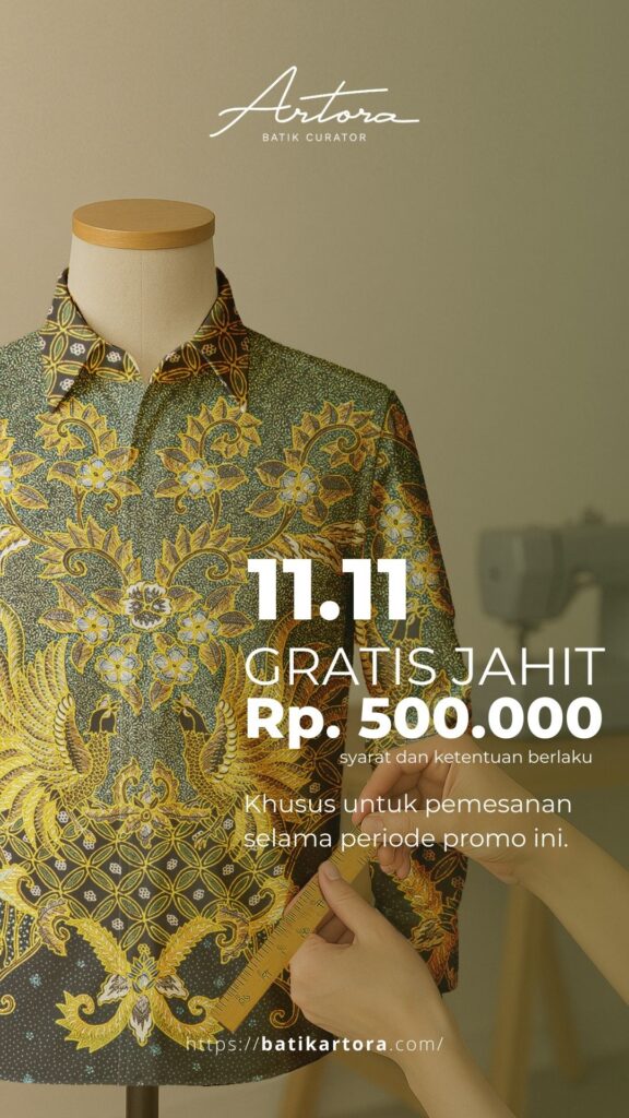
Choosing Models for Mockups Without Photoshoots
This part often surprises clients. But as you can see from the photo on the left, the results are still sharp and neat.
In fact, it's the opposite:
- High-resolution mockups now have very realistic quality, and you don't even need to buy them—just generate them yourself.
- The mockup model can be selected according to the brand's needs (age, style, pose, mood).
- Can be customized to match brand colors.
- No need to rent a studio.
- No need for multiple revisions.
- No need to wait for the model's schedule.
The result?
The client saved approximately 5–15 million in production costs. only from the part photoshoot just.
I once helped a local fashion brand that had originally set aside a budget of 12 million rupiah for catalog photos.
After seeing the high-end mockup (which I chose the model for), they just commented:
“Sir, how did you manage to make it this good? It looks like a real photoshoot.”
Yes... because the technology has reached that point, and clients rarely know this.
Designers who know how to utilize mockups can save clients a lot of money while still making the brand look expensive.
How do I choose and create the right mockup?
I usually choose based on several things:
- Model body proportions must be in line with the target market.
- Lighting must support the brand mood (soft, harsh, editorial).
- Angle must be suitable for highlighting the design.
- Material texture must be realistic so that the design colors do not change.
- Negative space must be present for copywriting or branding elements.
A good mockup isn't necessarily flashy.,
but which gives space for the visual message to emerge.

Here is one example of a mockup.
You can see that the mockup created by ai is already very good and high resolution. I just need to edit it in Photoshop for the color, shape, and to match the brand.
No Photographer Needed, But Guidance Is Still Necessary
Mockups are not instant.
I still made some adjustments:
- Color correction
- Shadow adjustment
- Adjusting the contrast level
- Adding or removing details
- Adjusting the model's skin tone to match the brand's tone
- Ensuring that the design does not “float” and truly blends in with the fabric/object
With neat arrangements, mockups can look more smoother than studio photos that are edited in a hurry.
Copywriting: The Soul of Visuals
One thing that is often forgotten: writing is part of design.
I didn't write copywriting at the beginning.
I usually write after all the visual concepts are locked in, so that the tone is consistent.
How I determine copywriting:
- See brand character
Are they friendly? Stiff? Elegant? Simple? - Take one keyword from the concept
Example: “calm.”. - Reduce it to a short sentence
- “Designed to make your day feel calmer.”
- “Colors that make your space breathe.”
- Provide relevant context
Good copywriting isn't just poetic. It must have a function. - Repeat until you find the right tone.
This usually takes the longest. That's where the art lies.
Copywriting doesn't have to be long.
The important thing is to be accurate.
A Brief Workflow That I Usually Use
To make it clearer, here is a simple outline of my notes:
- brainstorming ideas
- select keywords
- create a mood board
- determine the visual concept
- select mockup according to target
- insert the design into the mockup
- adjust color & lighting
- adjust the brand tone
- write short copywriting
- final layout for portfolio
This way, the average portfolio project can be completed 3–10 times faster.
Why Does This Workflow Save Clients Money?
Because:
- No photographer needed → save 3–10 million
- No need to rent a studio → save 1–5 million
- No model required → save 1–3 million
- No need to revise the location, weather, or schedule
- Everything can be revised digitally → faster
- Results can be consistent for the following years
The client is satisfied.
I'm also happy because the workflow is now light and flexible.


All of this is generated from mockups created by AI and customized according to the brand.
Conclusion
Ultimately, a portfolio is not just about “good pictures.”.
It is a complete story about how a brand is conceived, from the initial idea to the final visual that is ready to be showcased.
With a clear concept from the start, the right mockups, and cohesive copywriting, we can create a polished portfolio—without having to spend a fortune on photoshoots, without the hassle of scheduling models, and without losing any of that professional touch.
Every designer has their own working style.
What I am sharing here is just one method that has proven to be realistic, efficient, and budget-friendly for many of the clients I work with.
Ultimately, the creative process is essentially about finding the most relevant solution, not the most expensive one.
Hopefully, this article can help those of you who are building a portfolio or want to simplify your design workflow.